HOW TO CREATE A ROLLING WORLD WITH CSS ONLY
Making CSS interactive and practicing with different ideas are ways to
understanding it and even learn it fast. This does not only apply to CSS but
to any other language to want to learn.
In this article, we are going to have fun with css by creating a rolling world
as the preview above.
For this, we are going to need the following :
1. The table
2. The environment for the square
3. The 3D sphere
4. And some animations
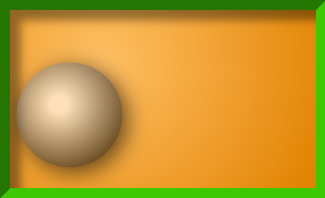
The table
The golden background table is a div element with a background, and some inset
border and shadow. Create a div element and assign the following attributes to
it. Here is the code :
.table{
    height: 170px;
    padding: 0;
    margin: 20px 5px;
    display: flex;
    align-items: center;
    overflow: hidden;
    background: radial-gradient(circle at 30% 30%,#FFBE61 1%,#E28300 95%);
    border: 10px solid #3AC800;
    border-style: inset;
    box-shadow: inset 10px 10px 8px rgba(0,0,0,.4);
}
In the above code, the background radial-gradient is used to give a sense of
light incident on the table. The same will be used for the sphere to give it a
3D appearance. The border style is also set to inset to give it an hollow
shape with an inset box-shadow that appears inside the table.
The environment
Open another div in the first div for the environment of the sphere. The aim
of this environment is to give the sphere a 3D perspective and size. Here is
the code:
 .box{
   height: 100px;
   width: 100px;
   perspective: 1200px;
   perspective-origin: 50% 50%;
   margin: 10px auto;
}
The above code contains a perspective of 1200px and a perspective origin of
50% for x-axis and 50% for y-axis. This is to center the sphere when animated.
Now that we have our table set, let's create our sphere.
3D Sphere
To get a 3D sphere, the first thing is to get a circle. Create another div
inside the previous div. It should have this CSS code:
.sphere {
    width: 200px;
    height: 200px;
    border-radius: 50%;
}
With this, we should have a circle. To always draw a circle, make sure the
width and height are the same and the border-radius is set to 50%.
Now let's give it some 3D view.
.sphere {
    width: 200px;
    height: 200px;
    border-radius: 50%;
    background: radial-gradient(circle at 30% 30%, #fff, #ddd 50%);
    box-shadow: -10px -10px 20px rgba(255, 255, 255, 0.5) inset, 10px 10px 20px rgba(0, 0, 0, 0.5) inset;
    transform: rotateX(0deg) rotateY(0deg);
}
The background radial-gradient is what gives the circle a sense of 3D. Circle
at 30% from the left and 30% from the top of the circle. This is where the
light will be. The box shadow gives the sphere a shadow and the transform
property is used to initialize the sphere in case of animation as will be seen
later on.
The code should now appear like this :
Now let's add the image of the world map and get it rolling. To do this,
create a figure div in the table element with the sphere. The sphere will be
positioned absolute to the sphere and it will hold the map.
Add the following CSS code for your figure element.
figure{
   height: 100%;
   width: 100%;
   border-radius: 50%;
   position: absolute;
   background: url('img/map2.png') repeat-x;
   background-size: 100% 100%;
   box-shadow: 5px 5px 20px rgba(0,0,0,.6);
   transform: translateX(0px);
}
You should have this :
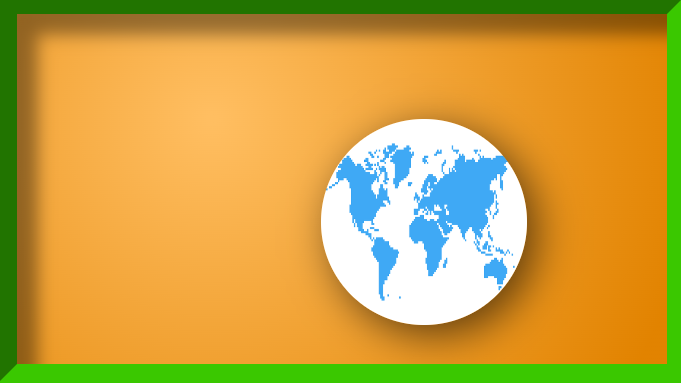
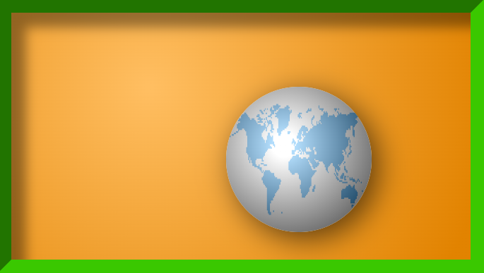
Notice that the image has overridden the shadow. You can recreate the shadow by adding the following line:
figure::after{
    content: "";
    height: 100%;
    width: 100%;
    border-radius: 50%;
    background: radial-gradient(circle at 40px 40px,white 10%,#000 80%);
    opacity: .6;
    z-index: 1;
    position: absolute;
}
We now have our shadow back. The opacity is set to 0.6 so as to make the map visible since the effect is over the map.
Now to the final step. Animations.
Animation
Two animations were used here. One that moved the ball from left to right and one which animate the map to scroll in the direction of the roll. The time of both animations were set to be equal and the directions were carefully adjusted so as to let the movement coincide and look realistic. If you set the move animation for the box without animating the map, the ball will appear as if it is dragged through the table. You can try this yourself.
Here are the codes for both animations:
@keyframes scroll{
    0%{
        background-position: -100px 0px;
       }
    50%{
        background-position: 0px 0px;
       }
    100%{
        background-position: -100px 0px;
       }
}

@keyframes move{
    0%{
        transform: translateX(-170px);
       }
    50%{
        transform: translateX(85px);
       }
    100%{
        transform: translateX(-170px);
        }
}
The move animation is for the box. It moves the ball from left to right.The scroll animation is for the map. Now let us give each element its own animation effect.
For the box, we have :
 .box{
   height: 100px;
   width: 100px;
   perspective: 1200px;
   perspective-origin: 50% 50%;
   margin: 10px auto;
   animation: move 5s infinite;
}
And for the figure, we have :
figure{
   height: 100%;
   width: 100%;
   border-radius: 50%;
   position: absolute;
   background: url('img/map2.png') repeat-x;
   background-size: 100% 100%;
   box-shadow: 5px 5px 20px rgba(0,0,0,.6);
   transform: translateX(0px);
   animation: scroll 5s infinite;
}
Here is the full code :
See the Pen Rolling world by THEBBOSS (@THEBBOSS) on CodePen.
Conclusion
Conclusively, the best way to learn how to do anything is to have fun with it. Just do it you own way and make sure you learn something new everyday.
© THE BOSS agada8428@gmail.com


Comments
Post a Comment